Advanced Print Setup:
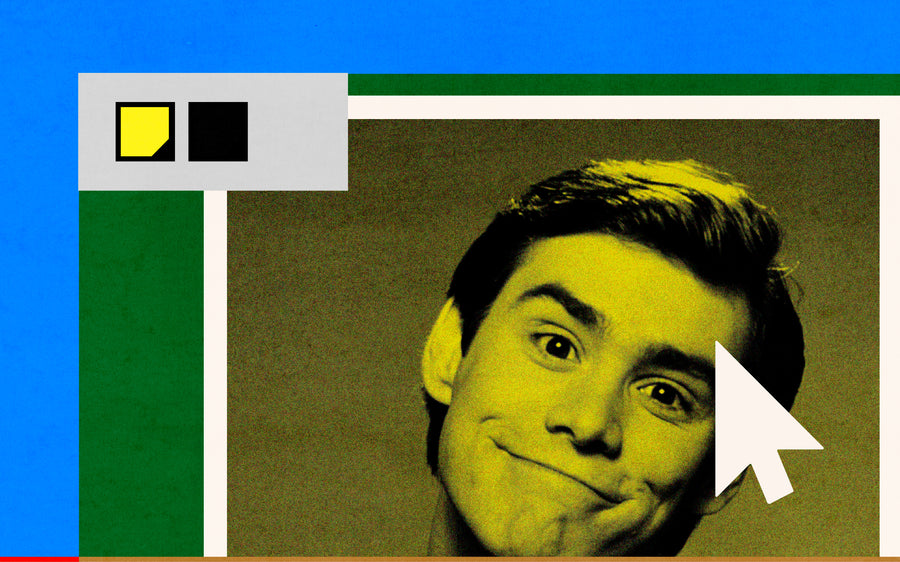
↑ Above, you'll find quick links to our most frequently searched information ↑
↓ Read on Below, if you're starting out, and ready to take a trip through the key riso buggets, neuances, and tips! This will help ensure your risograph artwork preparation will be top notch! ↓
Opacities:
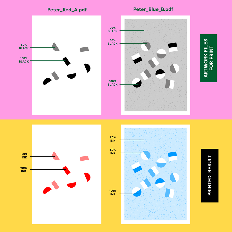
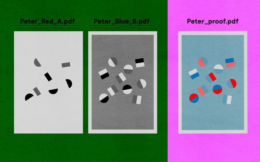
All files are sent to the printer in grayscale, and colours are added within the printing process.

Greyscale is translated to colour
The riso is very sensitive and will register different shades of black which will be visible in the printed output. So please ensure all tones of black have the same settings if you intend their output to be the same. The different opacities of greyscale, are represented as different opacities of your chosen colour.
Simply changing the document settings to ‘greyscale’ in photoshop for example, is not always be sufficient. This is especially true when working with lighter colours.
↓Ink Coverage↓
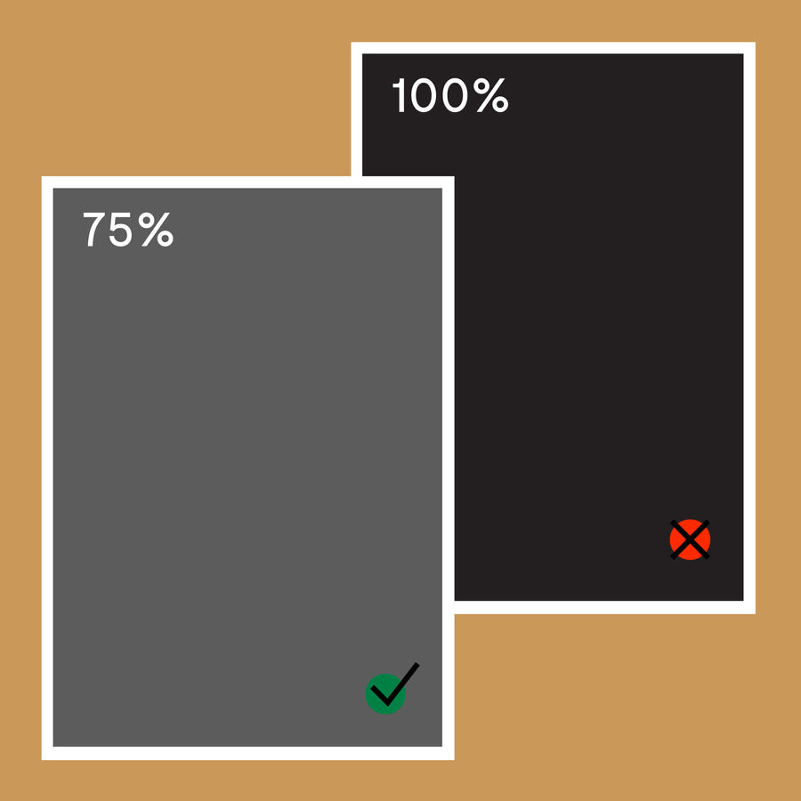
The riso can’t print 100% ink density across 100% of the paper. If wanting to print full coverage - drop the opacity to 75%.
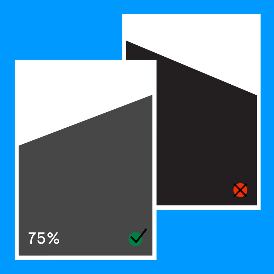
Large areas of solid colour can also cause problems. Especially around the top or bottom of the stencil. Try to keep one end clear, and opacities lower.
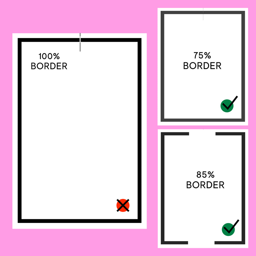
Heavy borders around the edge of the page can cause the paper to stick to the drum. Either reduce the opacity of these borders to 75%, or create blocks to stop the border at both lead ends of the page. You can get away with higher opacities if you opt for thicker paper.
Large areas with 100% Ink coverage will never print evenly.
Reduce the chances of ink transfer, and ensure a cleaner print:
→ Avoid large areas of solid ink.
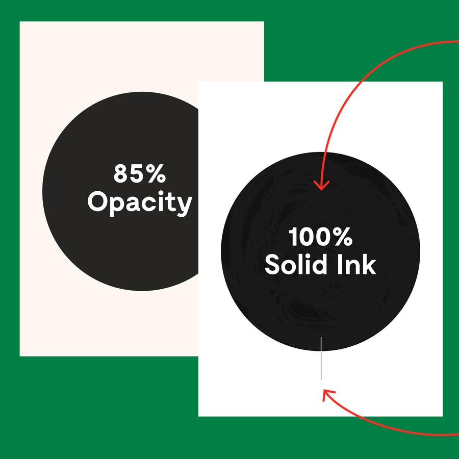
→ Reduce large areas of solid ink to a 75-85% Opacity (go lighter for a cleaner finish.
→ When printing small/medium areas of 'solid' coverage (anything above 3cm2), I'd also reduce their opacity to 95% - this won’t visibly change the appearance much, but will reduce the chances of ‘tide’ marks or flooding (visible inconsistencies across the surface) that occur when there is no 'filter' to regulate the ink.
→ Limit the number of colour layers to 2 or 4 (the more colours used, the more times the paper needs to be run through the machine).
→ Opt to have your prints ‘Blotted’. This can be found in the 'Extras' drop down on the order form.
Needle Marks occur when the paper is peeled from a very wet drum (can look like 'scratches' on a print).
TOP TIP = Opt for thicker paper when printing with lots of ink!
Track Marks
Track marks from the feed tire can appear when prints make multiple passes. Marks can also appear on double sided prints, from pressure impressions that can mark the next sheet of stacked paper if there is ink in this area.
*If marks do appear, most can be minimised with a rubber!
↓Gradients↓
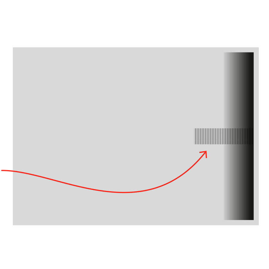
For best results, set gradients to range between between 90% > 10% and rasterise them individually before saving your PDF :)
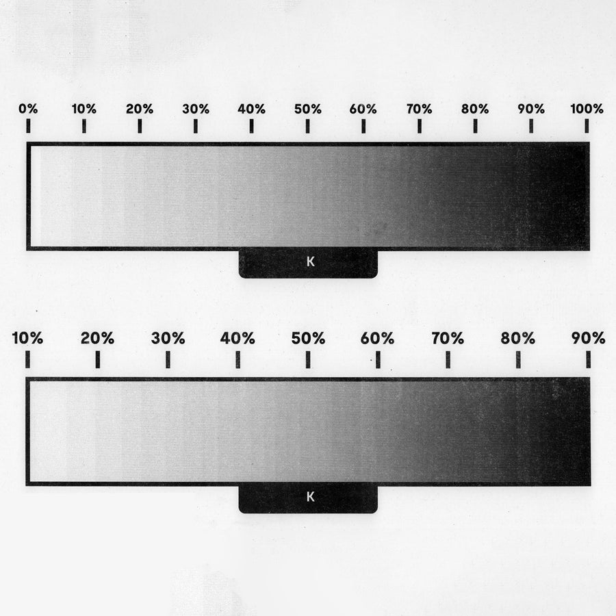
The riso doesn't print 10%→0% ink very well...
This is mainly an issue when printing Gradients or Photography, as the sudden 'drop off' can be very visible.
For Photography that has large areas containing 0-10% content, results can look better if the lightest part is increased to 10% too. (You can apply a 10% opcaity layer or 'tint' to fill in this white space).
Setting your darkest tones to 95% won’t visibly change the appearance much, but will reduce the chance of ‘tide’ marks or flooding that can happen over larger areas of ink coverage. (These create visible inconsistencies across the surface.)
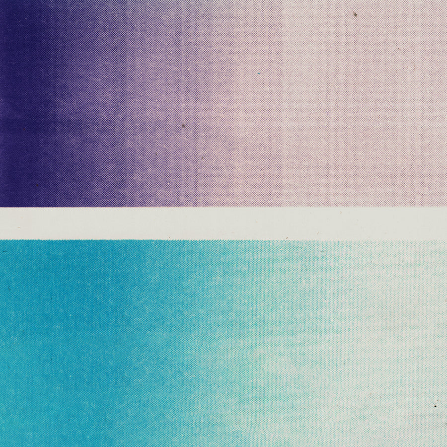
Gradient Stepping Issues
You can see from the Purple gradient, there are faint 'Steps' as the the ink gets lighter. These are the result of Vector generated gradients, but can be fixed by rasterising them before saving and enhanced further by adding 'noise' affects in photoshop (as seen in the Aqua Gadient).
Be careful not to add too much 'noise' though. It might not look like much on screen, but in print it can be a lot more visible.
We can prepare your files for optimum gradient printing if you are unsure. You can add this service as an 'Extra' when ordering your prints.
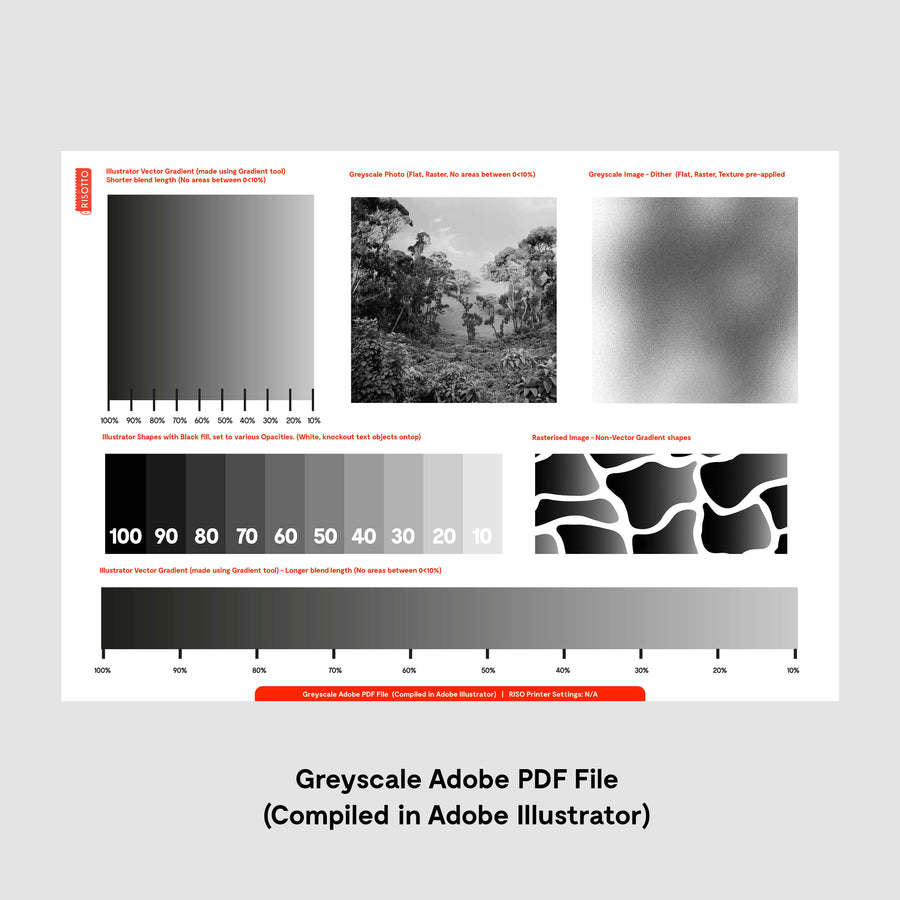
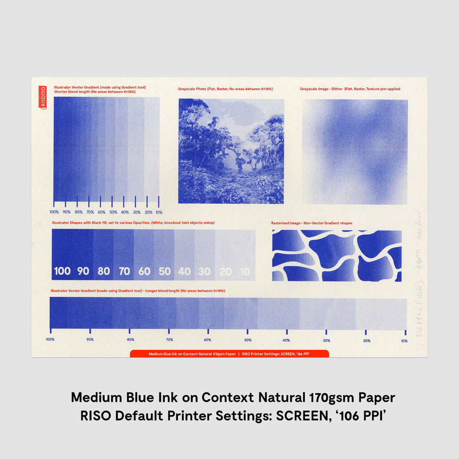
Above Captions (From Left to Right, by Row)
1. Illustrator Vector Gradient (made using Gradient tool)
Shorter blend length (No areas between 0<10%) | 2. Greyscale Photo (Flat, Raster, No areas between 0<10%) | 3. Greyscale Image - Dither (Flat, Raster, Texture pre-applied | 4. Illustrator Shapes with Black fill, set to various Opacities. (White, knockout text objects ontop) | 5. Rasterised Image - Non-Vector Gradient shapes | 6. Illustrator Vector Gradient (made using Gradient tool) - Longer blend length (No areas between 0<10%)
Text/Type & Fine Lines ↓
Setting registration black
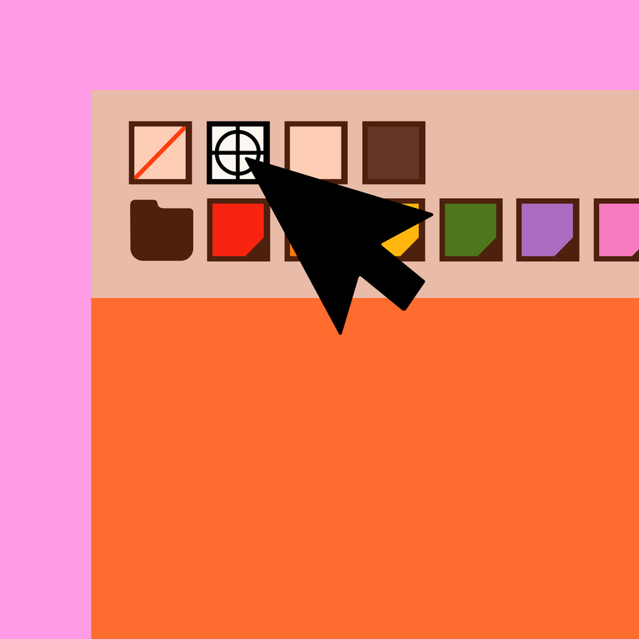
To print solid areas of colour, and specifically any small details that should appear crisp and smooth (and in 100% ink), these areas of the artwork should be set to 'Registration black', which is often indicated by the cross-hair symbol and can found in SWATCHES panel.
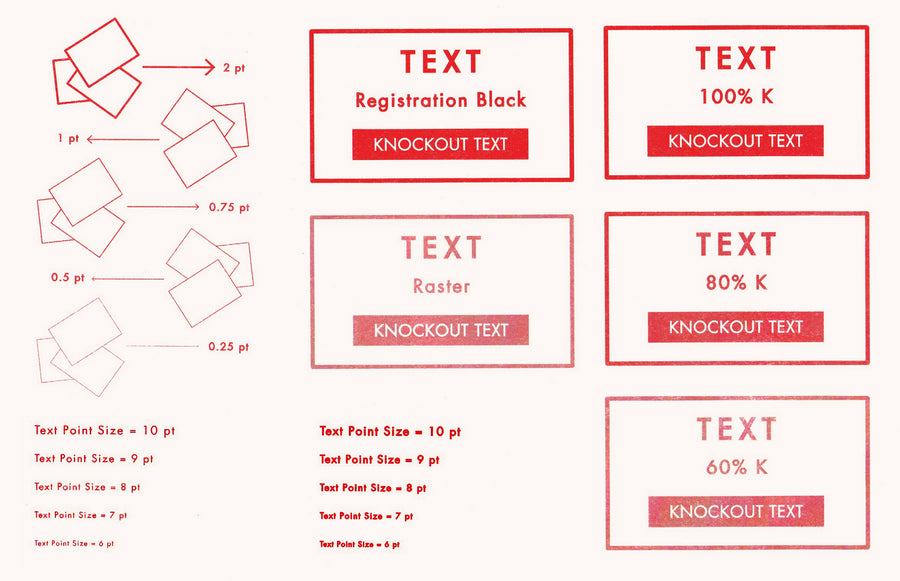
Text prints best when set to registration black, and kept in vector form; which is created when working from Illustrator or InDesign (Not Photoshop - as this will rasterise it (ie. make it an 'image')).
Use normal black (100% K) for type 14pt or above to avoid excess ink.
To retain any text & line art as vectors when exporting artwork; do not rasterise them, and never export as a jpeg.
Minimum text pint size = 7 PT
Minimum Line Thickness = 0.5 PT*
*settings should be registration black
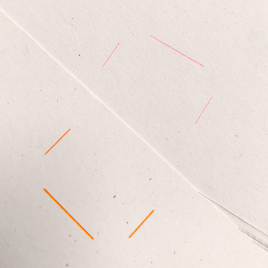
If you are using fine lines or text in Photoshop, it will 'rasterise' them; making them into an image (rather than vector). The printed result will appear 'jaggy' around the edges instead of being smooth line.
This will also happen if a vector is not set to 'Registration black', or when files are saved as Jpegs. This is because the riso will read it as a tone, rather than solid, and create a bitmap (dot screen) in order to re-create the lighter 'tonal' appearace. So any fine lines (or text) can appear pixelated instead of smooth.
The Pink lines in the top right was printed from a Jpeg file (Registration black).
The Orange and Yellow lines in the bottom left, were vector lines, printed from a PDF (Registration black).
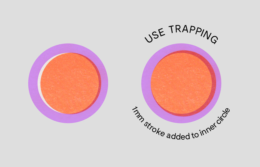
If you have a lot of graphics that need to be closely aligned - add trapping to your artwork.
As each colour layer is printed, registration is rarely perfect, so by designing trapping into your designs (extending the stencil areas, so that the shapes overlap each other), you can reduce visibility of mis-registration.
Advanced RISO Tutorials & Free Tools
Check out our step by step guides on everything from Saving files, to separating CMYK artwork for print:
CREATING DUOTONES:
SEPARATING CMYK CHANNELS FOR TWO COLOUR PRINT IN ADOBE PHOTOSHOP
A5 ZINE LAYOUT:
LAYOUT AND IMPOSITION FOR AN A5 ZINE IN ADOBE INDESIGN
VECTOR SEPARATIONS:
CREATING STENCILS FROM VECTOR ARTWORK IN ADOBE ILLUSTRATOR
Download our RISOTTO Print Bible
Learn everything you need to know about setting up a riso print